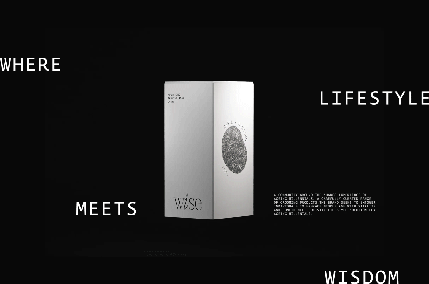
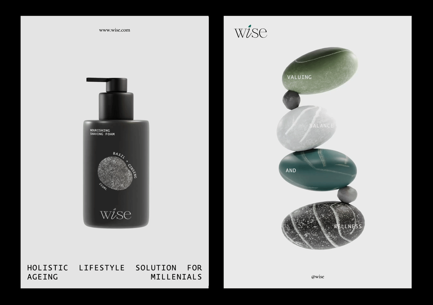
Wise Personal Grooming Care
Wise is a philosophy designed to accompany aging millennials on their journey into and out of middle age. Our range of lifestyle grooming products is meticulously crafted to empower this demographic. At the heart of Wise lies a commitment to utilizing the best functional ingredients, reflecting our dedication to holistic well-being.
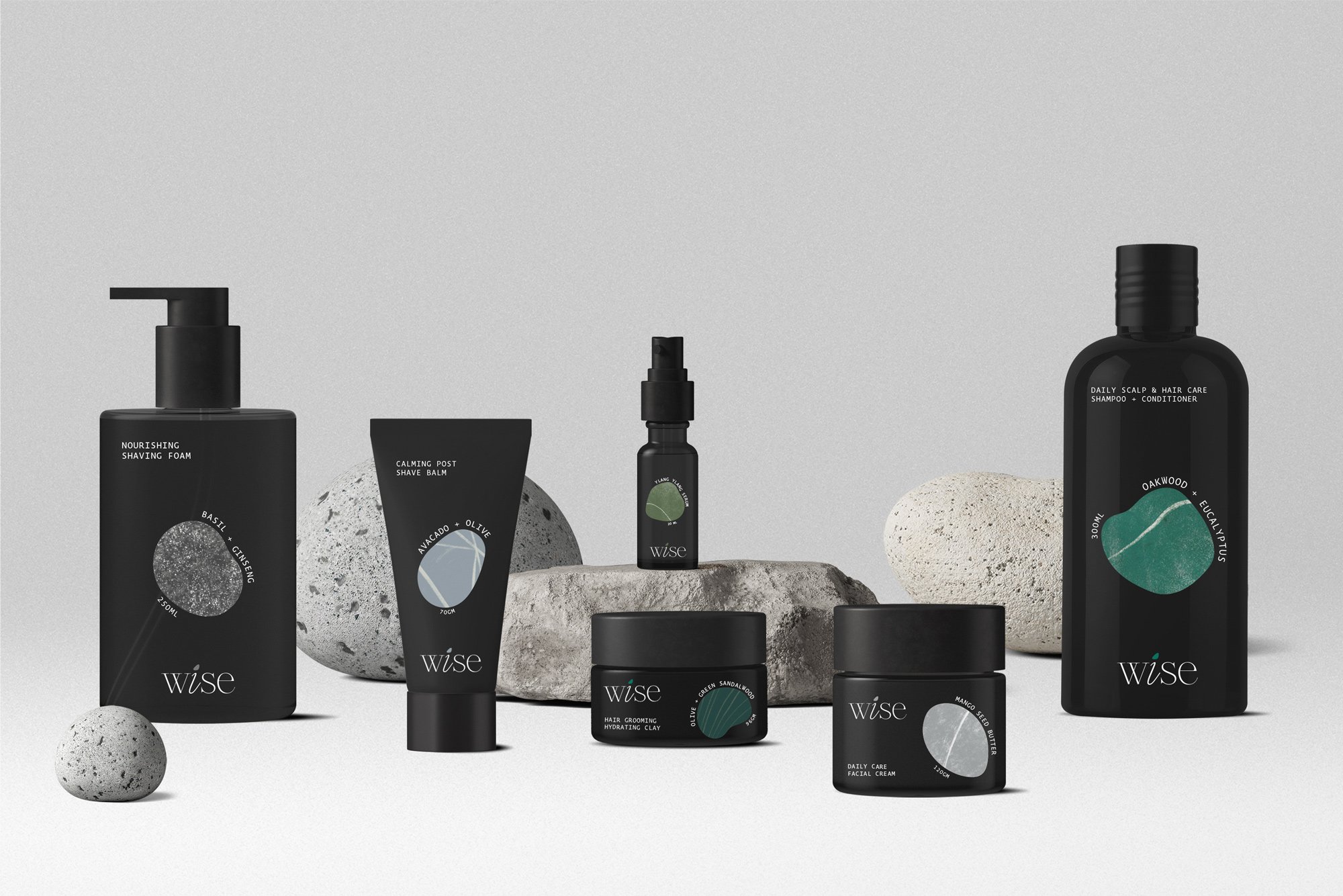
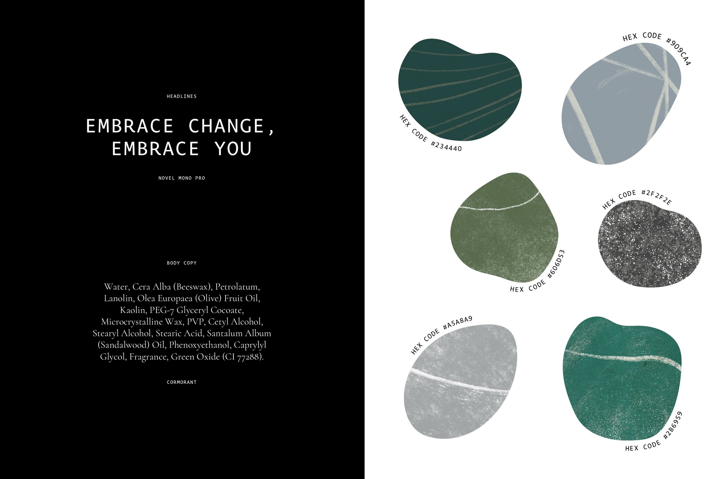
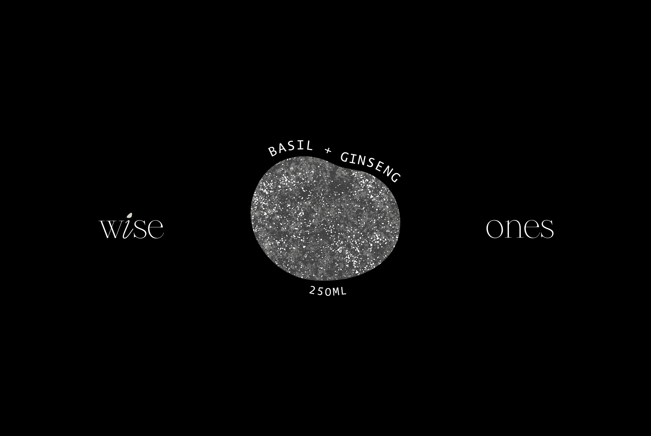
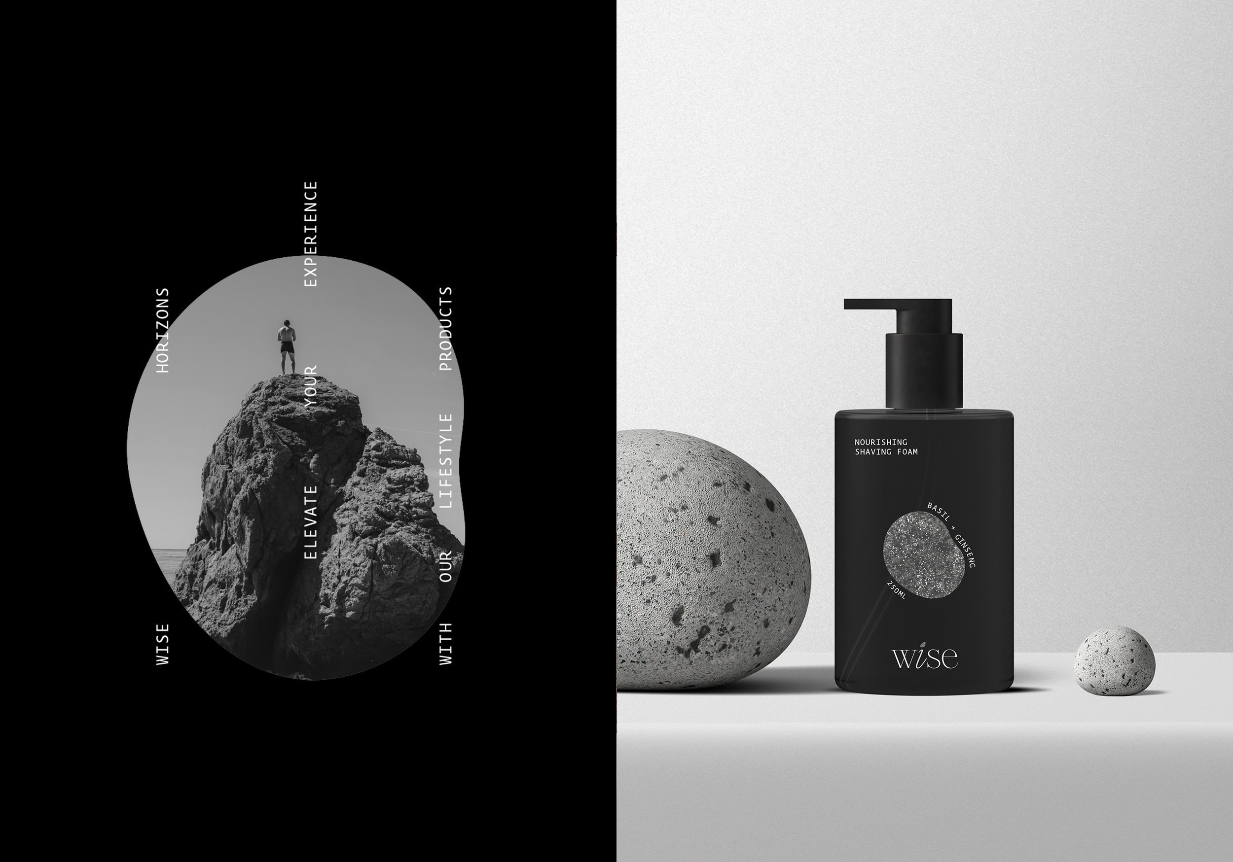
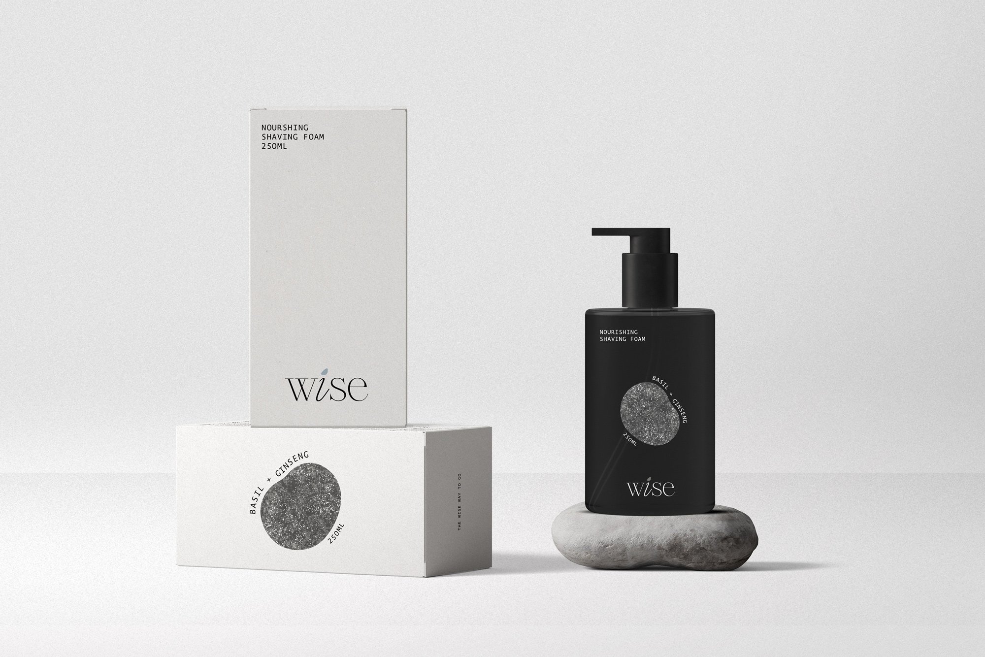
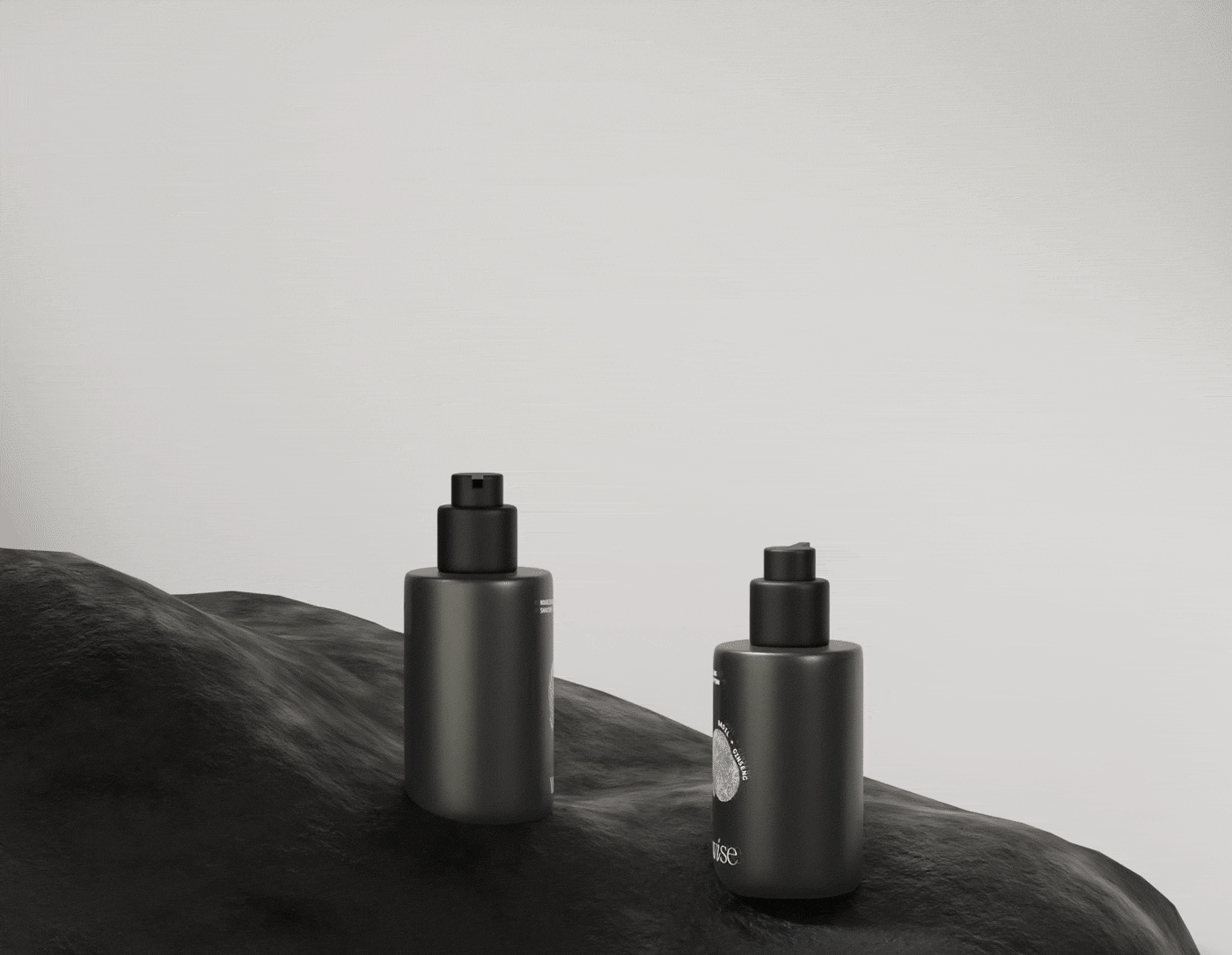
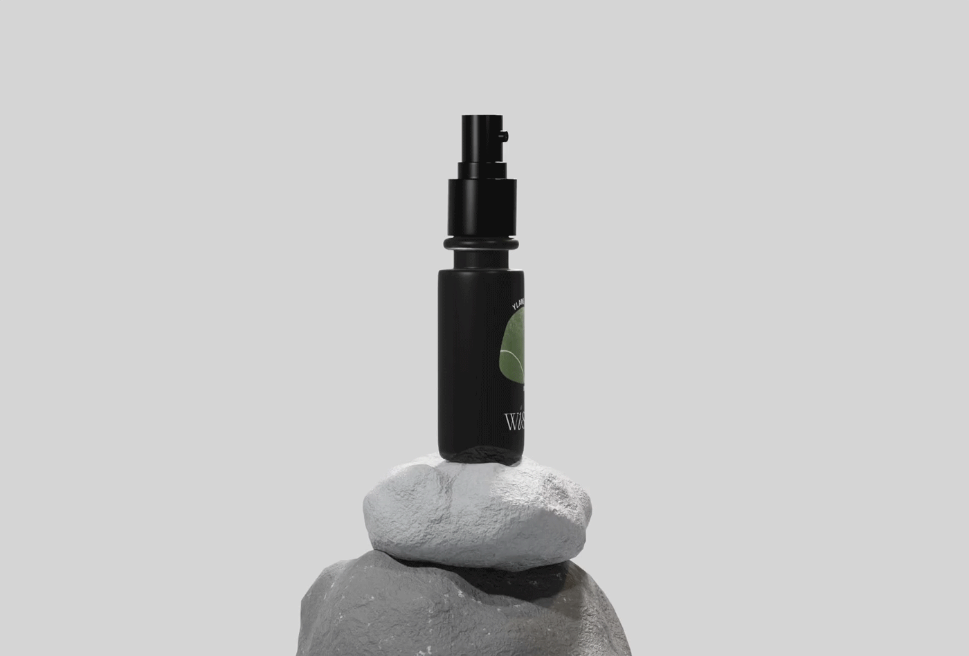
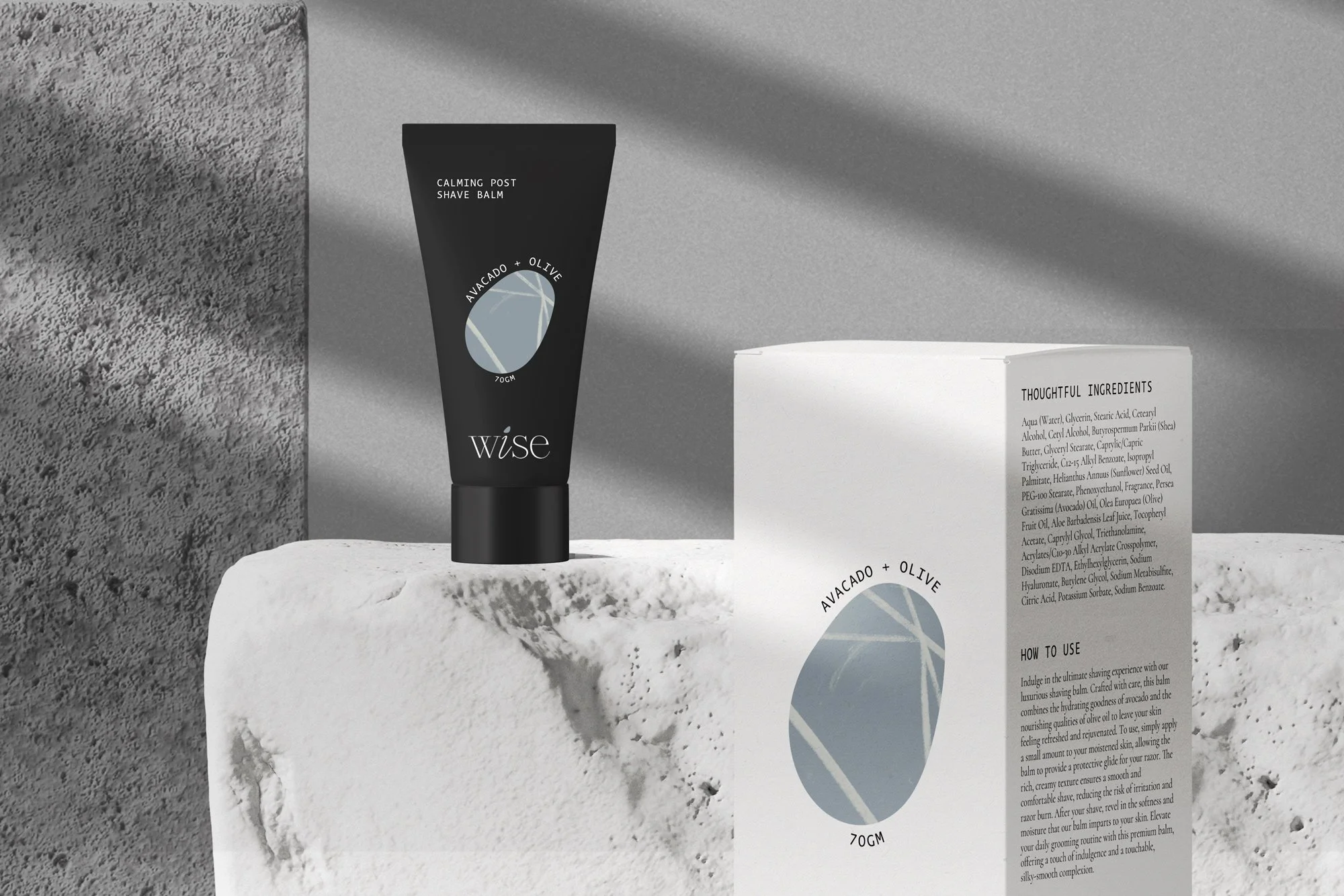
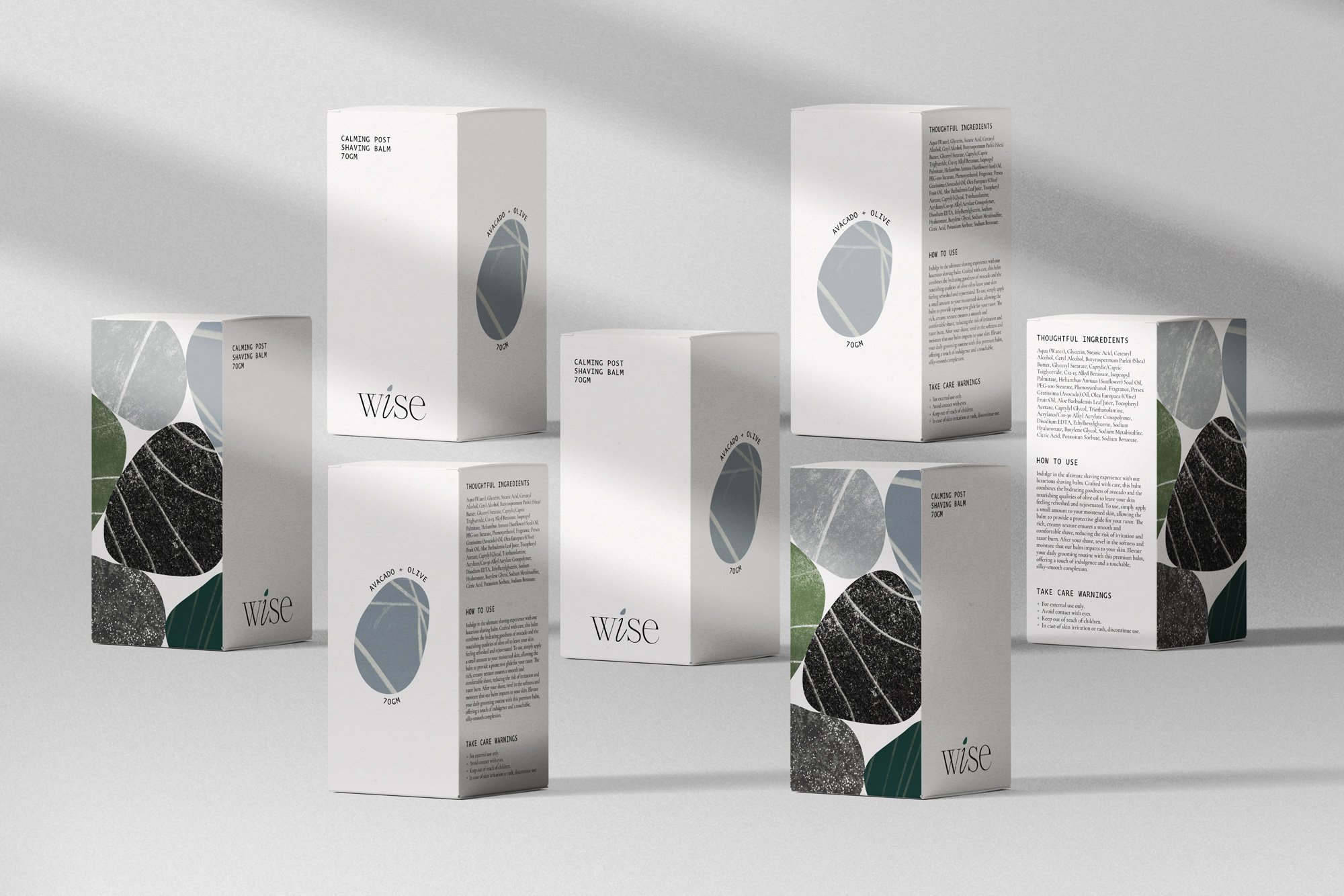
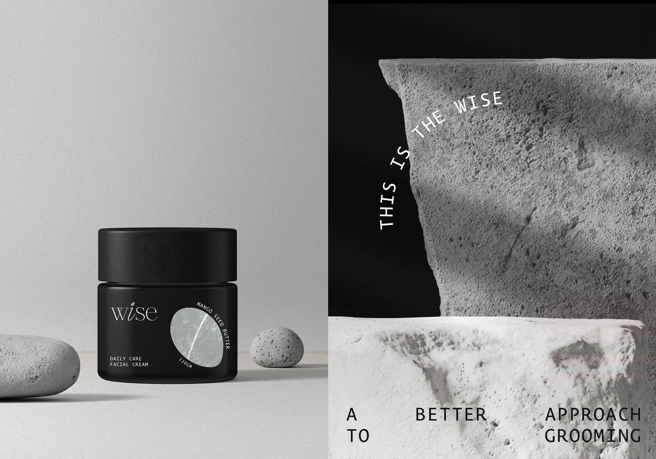
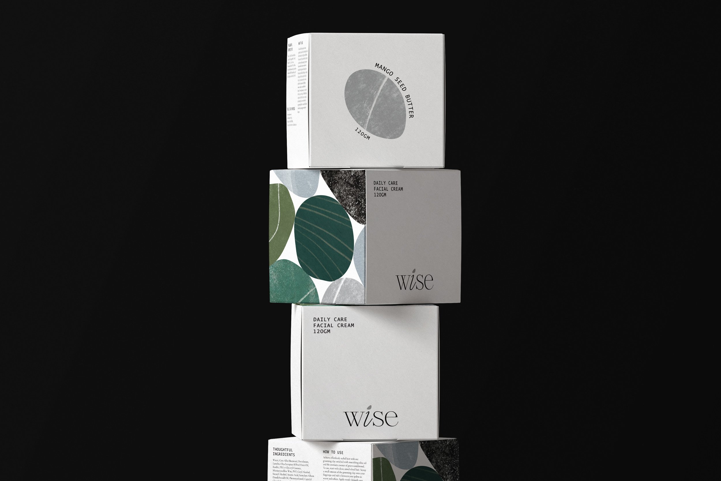
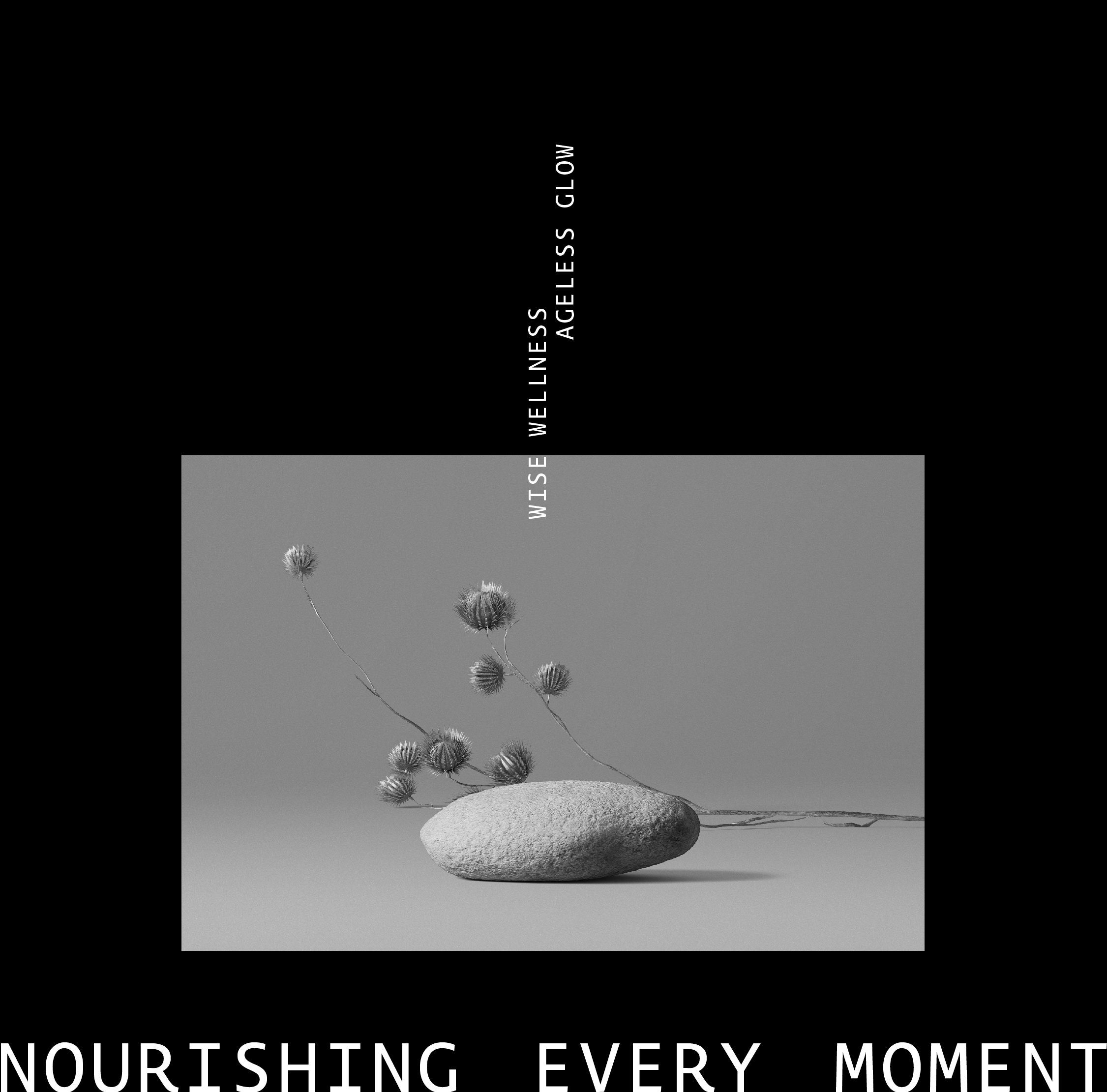
The core concept of Wise revolves around the wisdom that comes with age, emphasizing the understanding that worthwhile transformations take time. Drawing inspiration from the gradual smoothing of rocks by the ocean, we've translated this idea into abstract pebbles, the visual centerpiece of our packaging. This symbolism mirrors the brand's commitment to a gradual, thoughtful approach to ageing. Wise employs clean and elegant typography that communicates sophistication and clarity.
The brand logo, a stylized representation of wisdom, incorporates subtle elements reflecting the journey of ageing. The overall branding elements exude a sense of calm assurance, inviting users to embrace the process of maturation with open arms.
The packaging features abstract forms of pebbles, symbolizing the gradual transformation that comes with wisdom and time. These forms are not only aesthetically pleasing but also serve as a metaphor for the brand's forward-thinking approach to ageing. The minimalist labelling hierarchy adds a touch of playfulness, providing a foundation that can evolve as the brand grows. Soft, earthy tones evoke a sense of calm and timelessness, while the abstract pebbles create a visually appealing and cohesive theme across the product line.